WealthTree
Improving financial literacy and management for young, working women in the United States

Define
Problem Statment
How might we elevate the level of financial literacy and enhance the comprehension of financial management for young, working women in the United States?
My Roles
UX Design: design system, ideation, external brainstorming, storyboard, sketches, wireframes, prototyping, user testing, heuristic evaluations, iteration
UX Research: observations, competitive analysis, survey, interviews, empathy map, research analysis
Tools Used
Figma
Notion
Qualtrics
Project Context
Fall 2023 - Spring 2024
Team:
Adviti Atluri, UX Researcher
Druti Naik, UX Researcher
Dr. Carrie Bruce, Process Advisor
Dr. Whitney Buser, Subject Matter Expert
Primary Users
Women aged 18-30, varying socioeconomic and educational backgrounds, early in their career or financial journey, and planning for the future
Research
Overview
11 Literature Reviews
6 Exploratory Interviews
1 Subject Matter Expert Input
11 Resources Compared In-Depth
2 Observation Sessions
79 Respondent Survey
11 Semi-Structured Interviews
Research Analysis
My teammates and I synthesized data from user interviews through affinity mapping—generating 335 sticky notes from our interpretation session.

By visualizing our user’s thoughts, feelings, actions, and observations through an empathy map, I was able to pull out pain points and areas of opportunity.
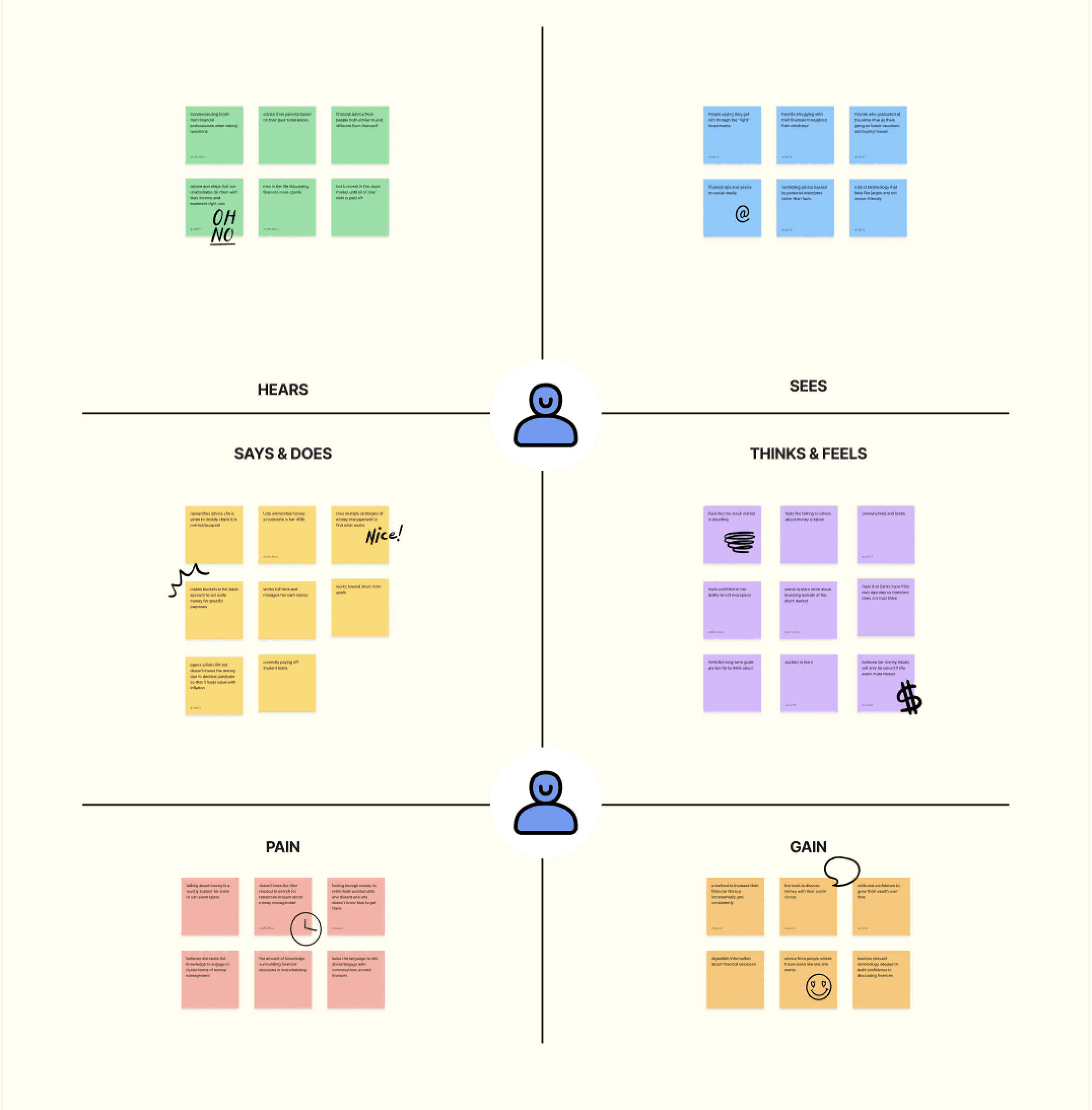
Knowledge
Pain: Lacking knowledge including terms and languages to engage in certain practices
Gain: Digestible information about financial decisions and terms
Time
Pain: Not enough time needed to search for resources to learn about money management
Gain: A central hub to increase their financial literacy incrementally and consistently
Resources
Pain: Having enough money to retire feels unattainable and distant
Gain: Skills and confidence to grow their wealth over time; need to visualize what saving for retirement looks like
Key Insights
Confidence through Research & Terminology
Women feel more confident about their financial decisions when they have knowledge, terminology, and a plan
Time is a Barrier to Financial Decision Making
Many participants felt as though they did not have enough time to make smarter financial decisions or to expand their financial knowledge
Low Confidence in Long-Term Goals
Participants felt most confident about their short-term financial decisions and least confident about their long-term financial decisions
Trust in Verified Financial Institutions
Participants trust online sources such as Morningstar, Fidelity, and E-Trade, but these sources vary between participants
Design
Design Requirements
Transforming research insights into design requirements allowed me to begin the design process with clear guidelines.
Empowerment through Terminology
Our intervention should be a central resource that empowers users with the terminology needed to feel confident when discussing finances
Brief Lessons
Our intervention should provide brief lessons for people with limited time
Simplify Long-Term Goals
Our intervention should make long-term financial decisions simplified and feel more attainable and short-term goals should be emphasized
Custom Information
Our intervention should be customizable depending on our users’ informational wants and needs
Brainstorming
I led 8 participants in a brainstorming exercise and generated more ideas through an internal crazy 8s brainstorming session.

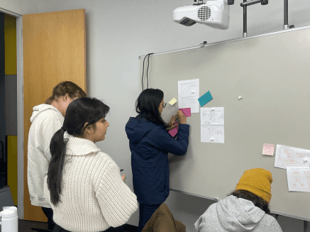
Ideas were compiled, comparing them against research findings, design requirements, feasibility of time, and development skills.
Sketches
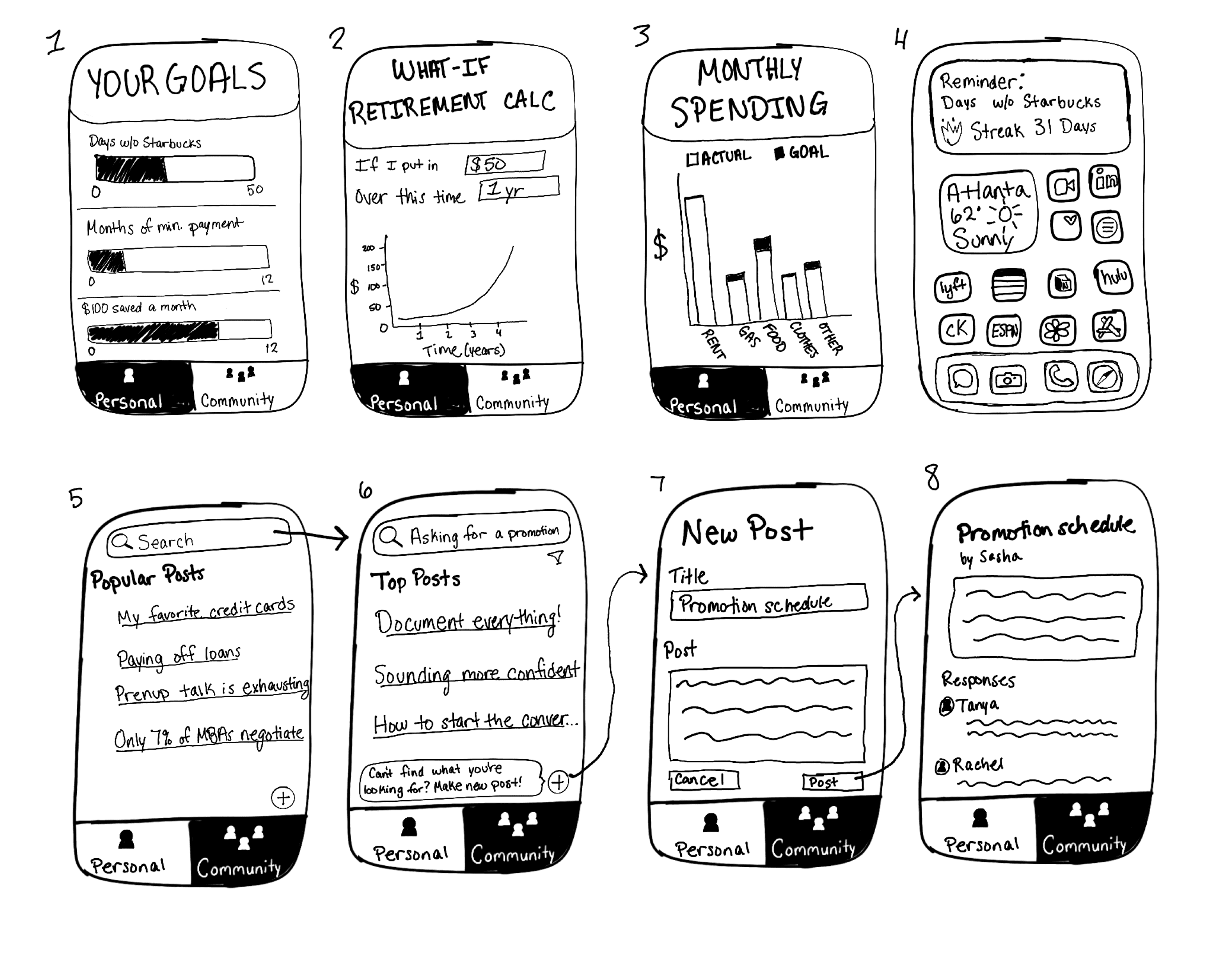
Sketch Feedback
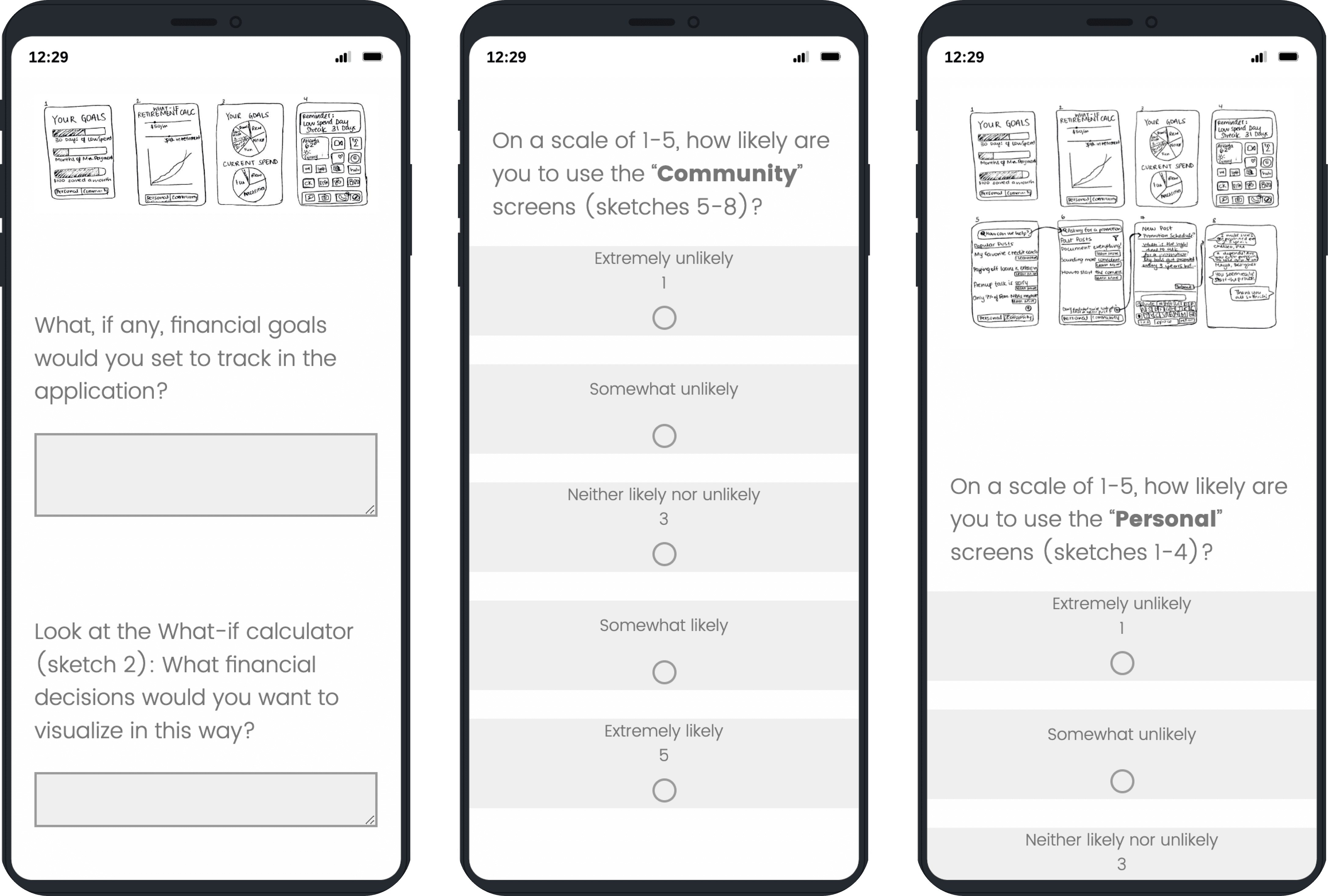
We surveyed 22 MS-HCI students and acquaintances within our target demographic.
Key Insights
Personal and Community Aspects
Most users said they were likely to use both the personal and community pages
Not-so-popular 'Popular Posts'
Almost half of the users voted popular posts as the least useful feature
Envisioning Saving for Retirement
The most frequently cited aspect users envisioned utilizing this product for was saving for retirement
Wireframes
Onboarding
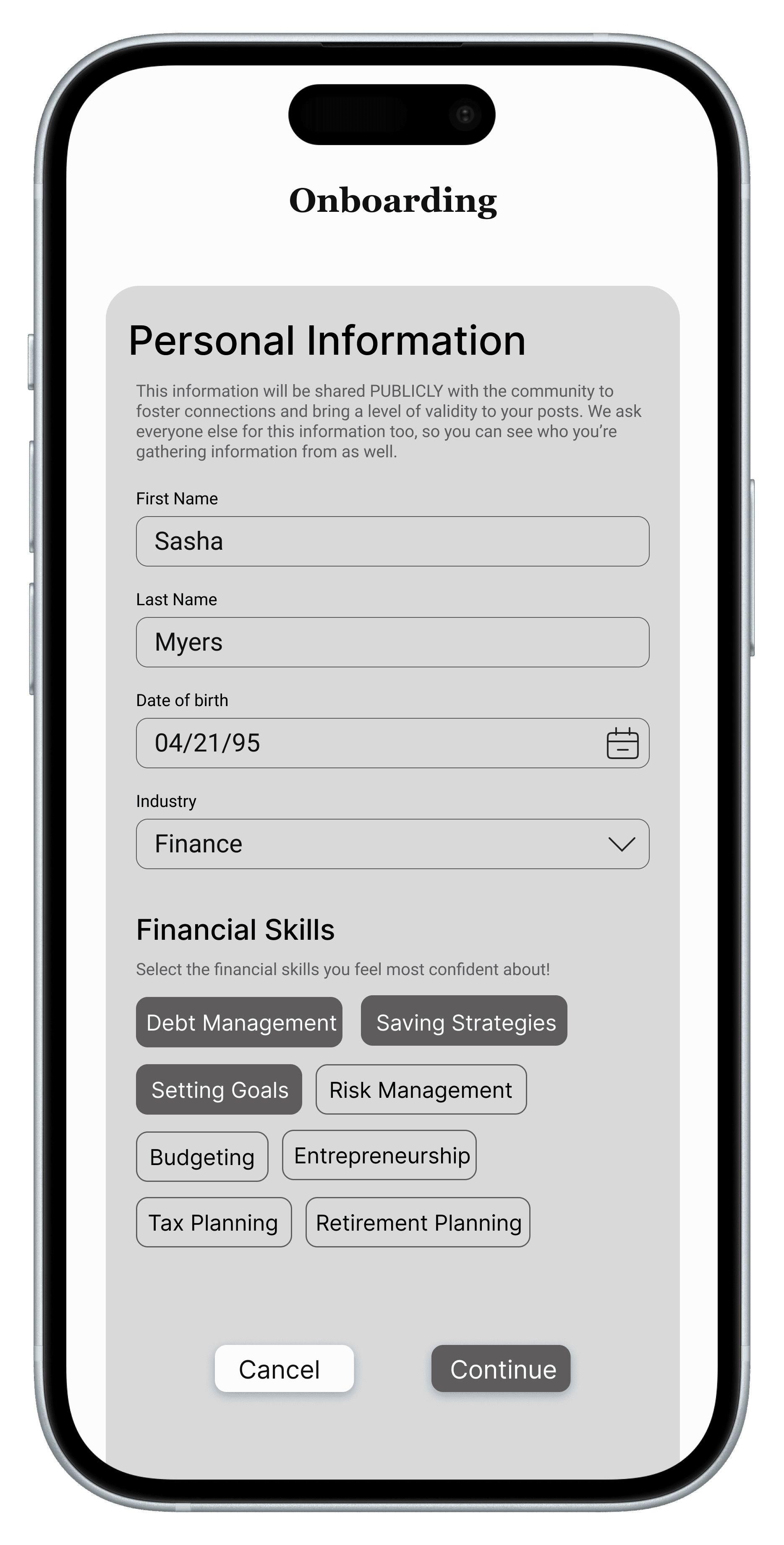
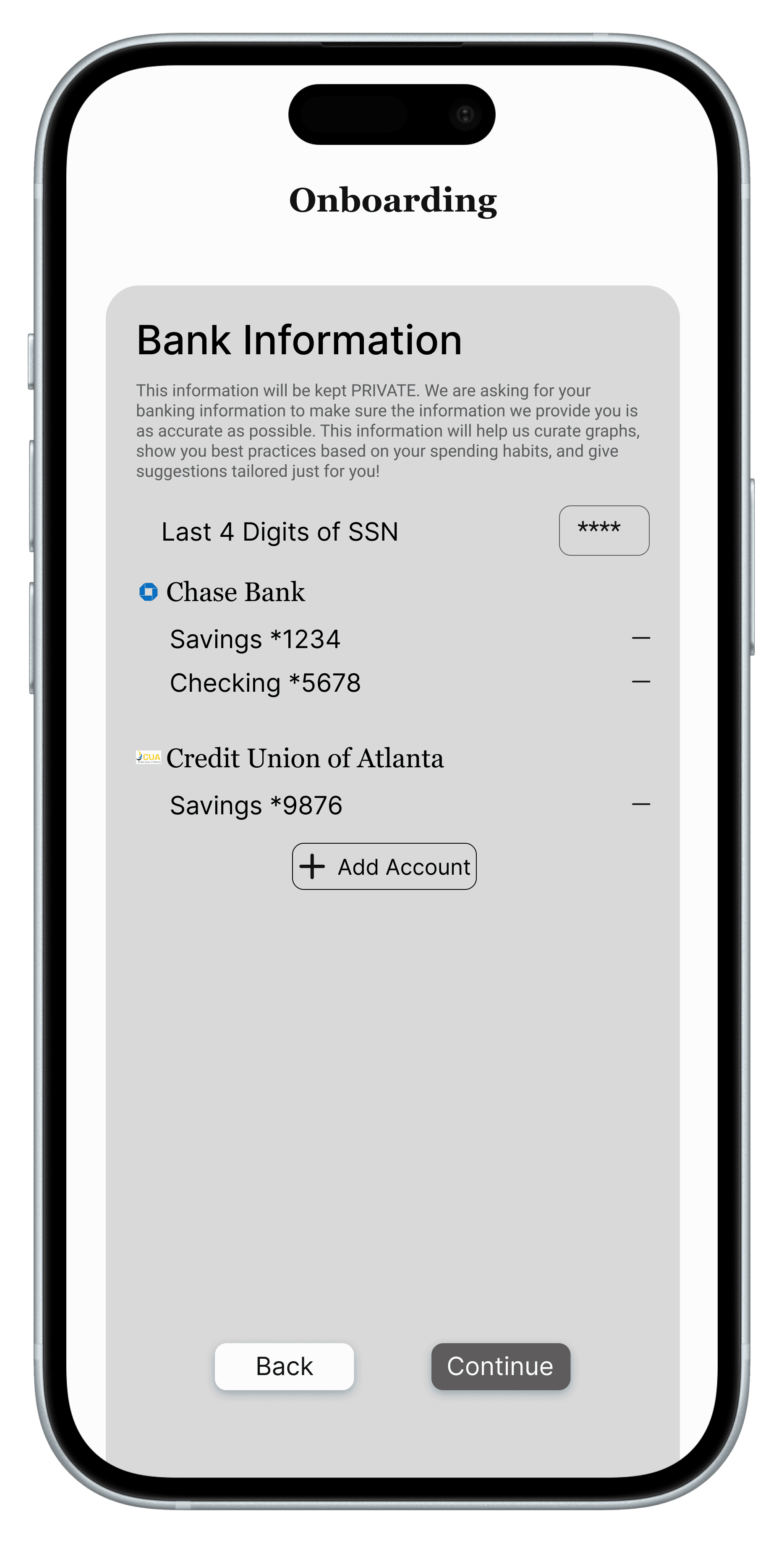
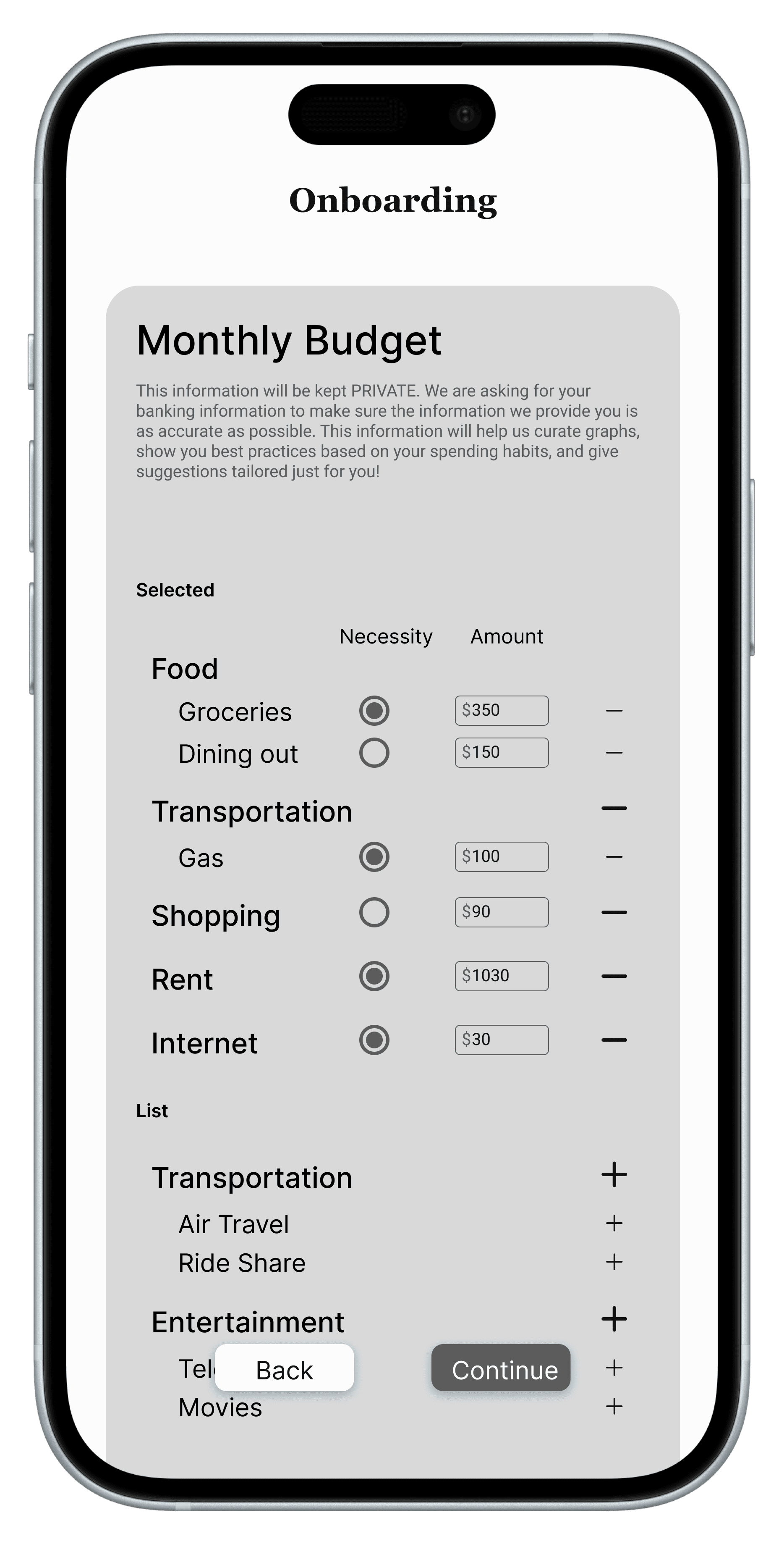
Personal
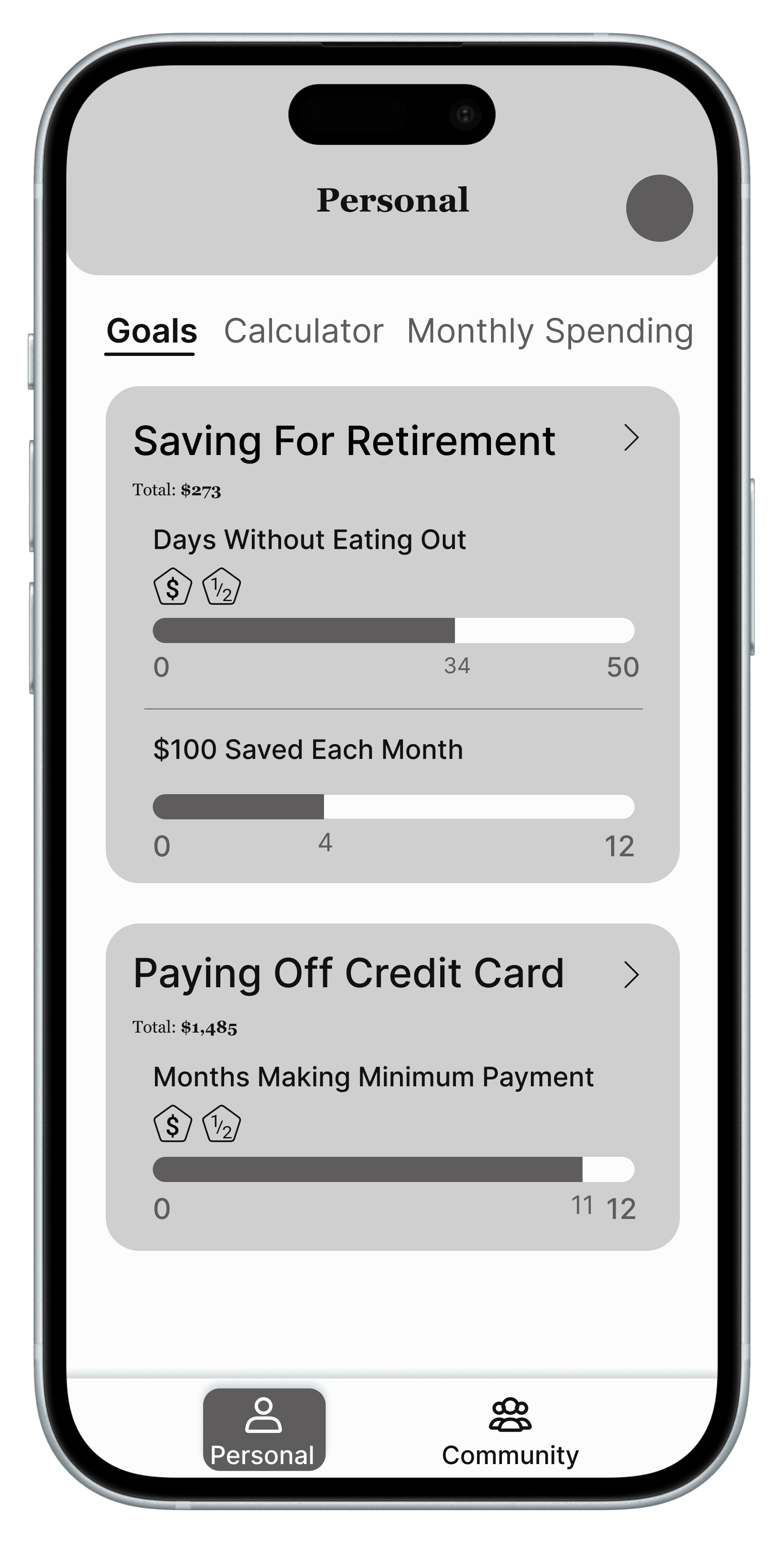
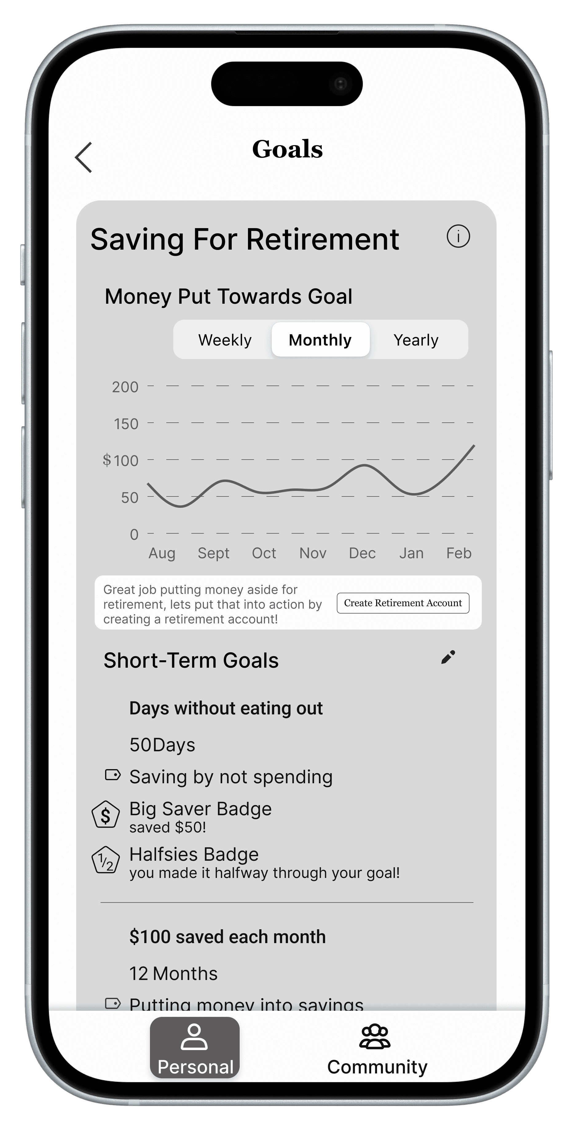
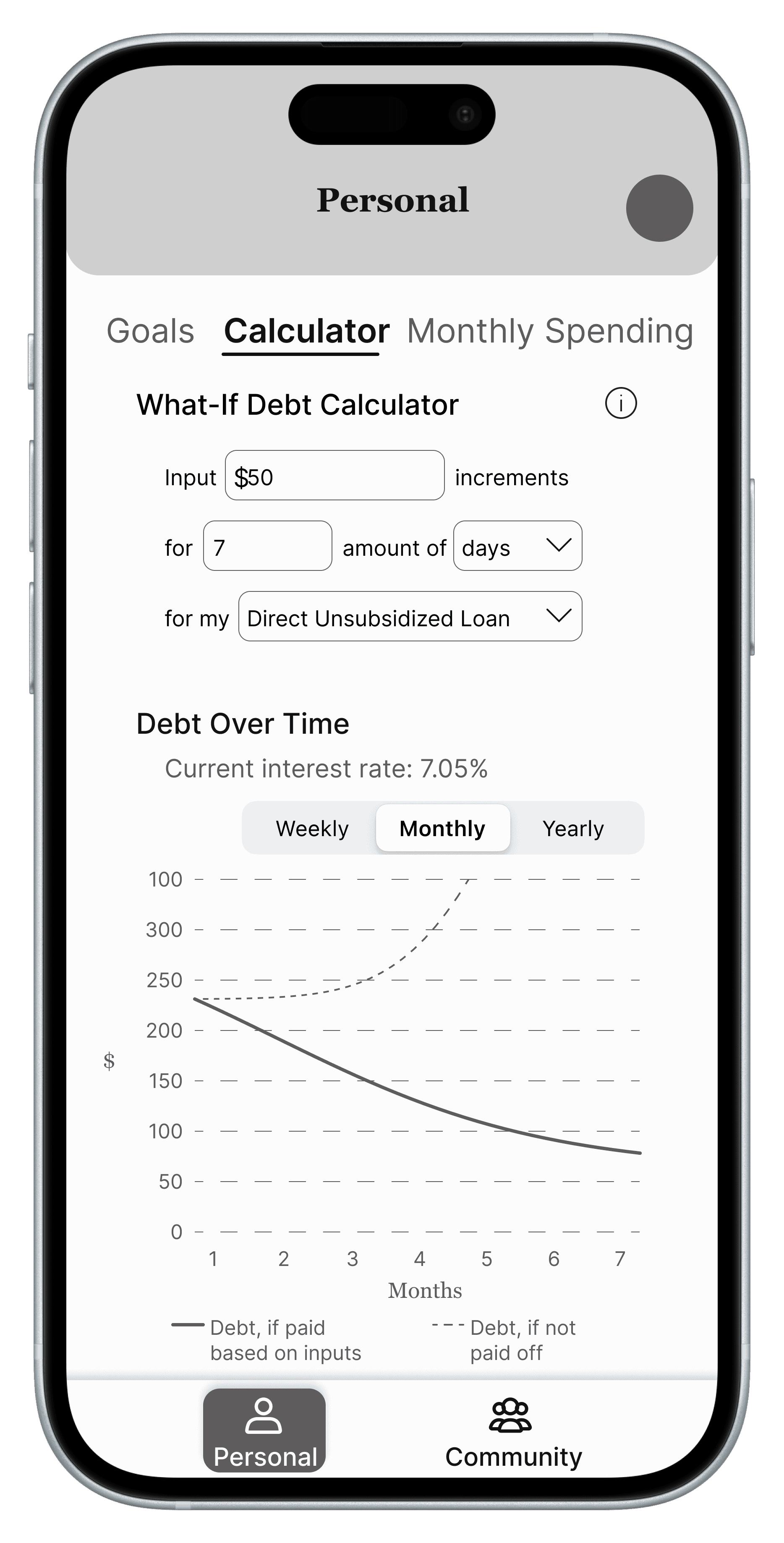
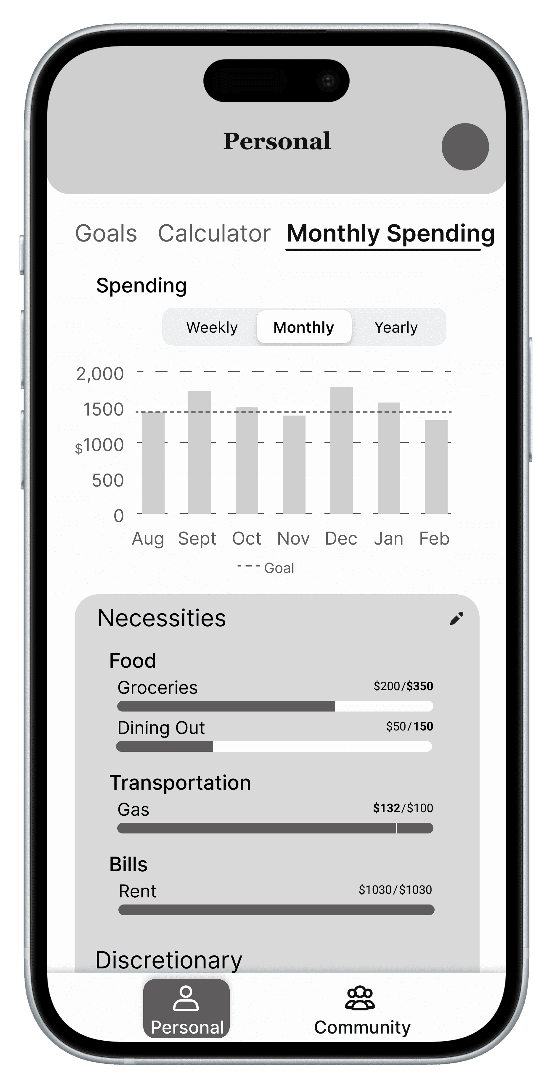
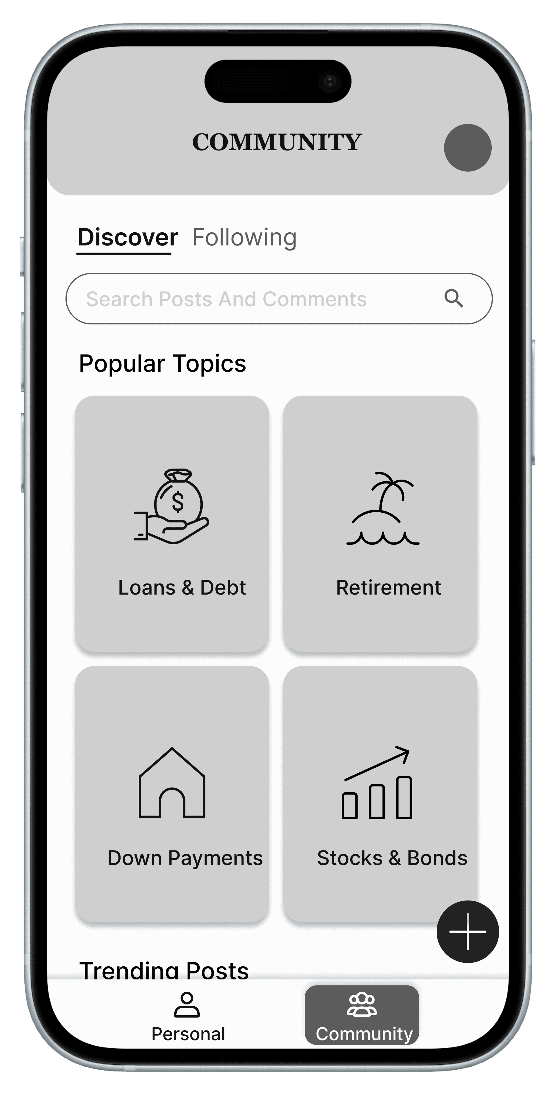
Community
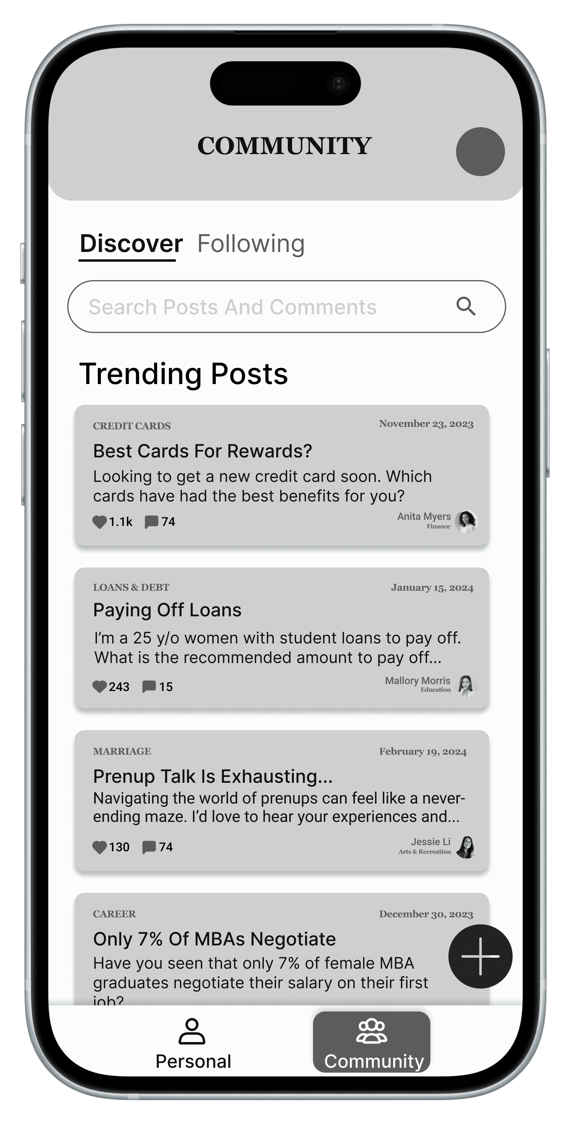
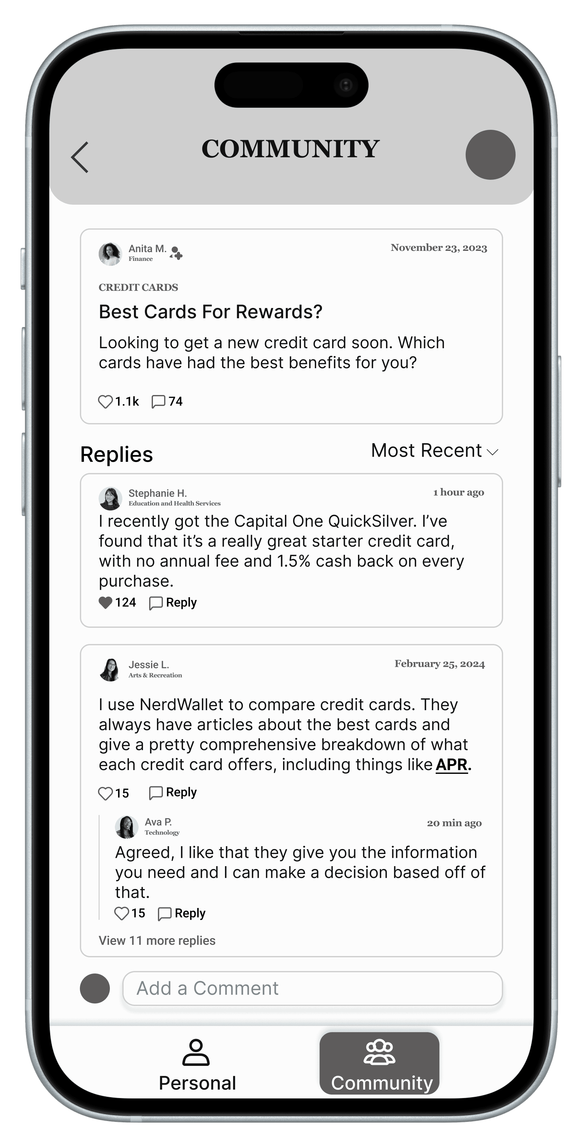
Profile
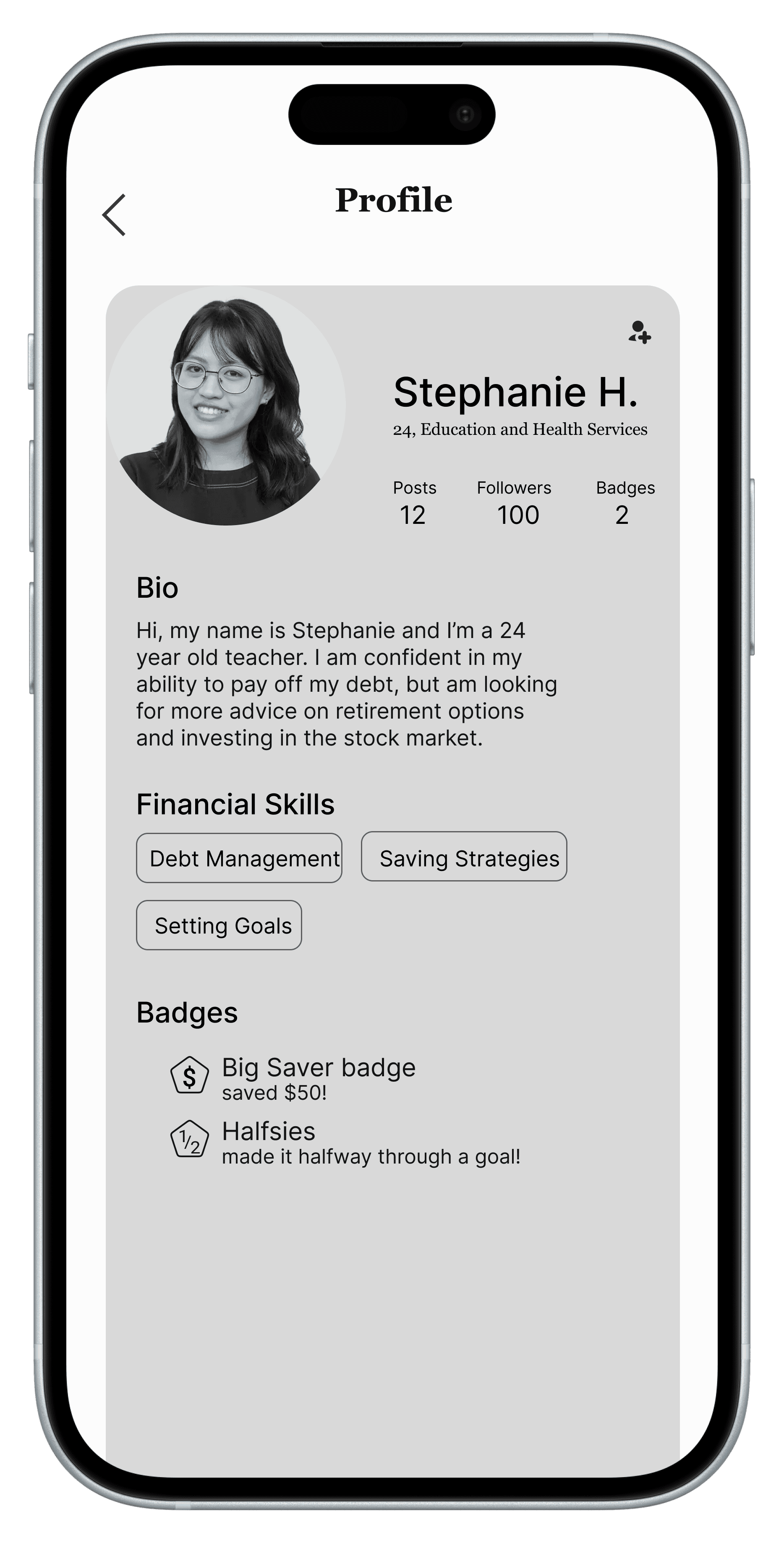
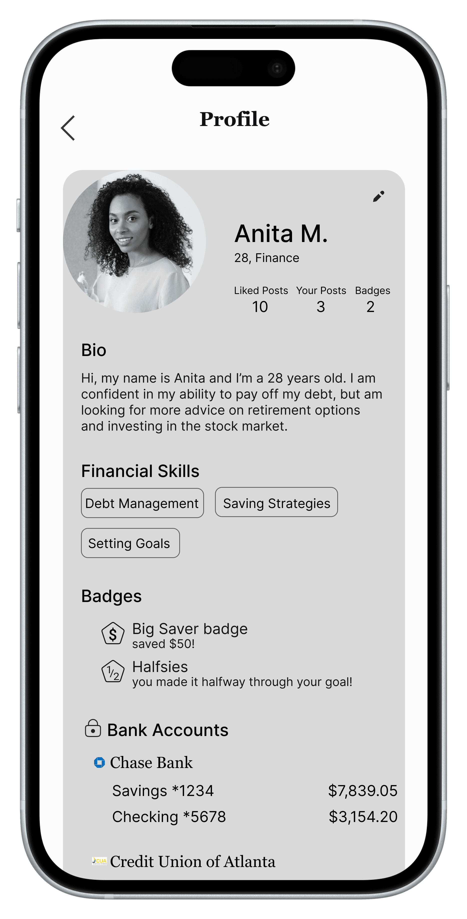
Wireframe Testing
We tested our mid-fidelity prototype with 8 participants for usability, comprehension, appeal, and balance.
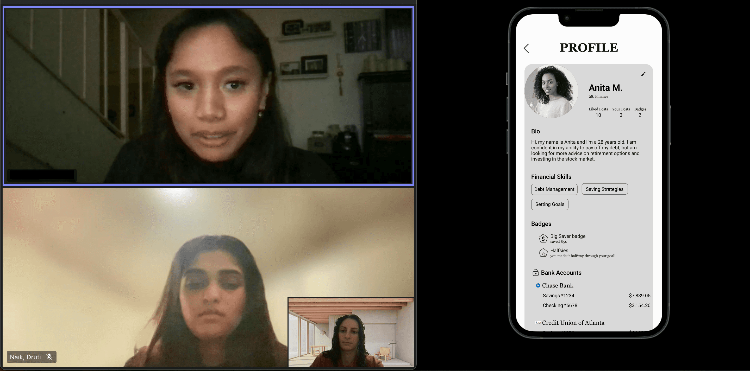
Wireframe Testing Insights
Privacy

said having to enter SSN in onboarding would stop them from continuing or they wanted to learn more about the app first
7 out of 8
Community

were hesitant to trust information from others in the community section
5 out of 6

were expecting to see more of a learning/literacy aspect
5 out of 6
The Big Pivot
Based on brainstorming outcomes and wireframe feedback we pivoted part of our solution, swaping the community section with a learn section and got positive feedback on it from the final 2 users.
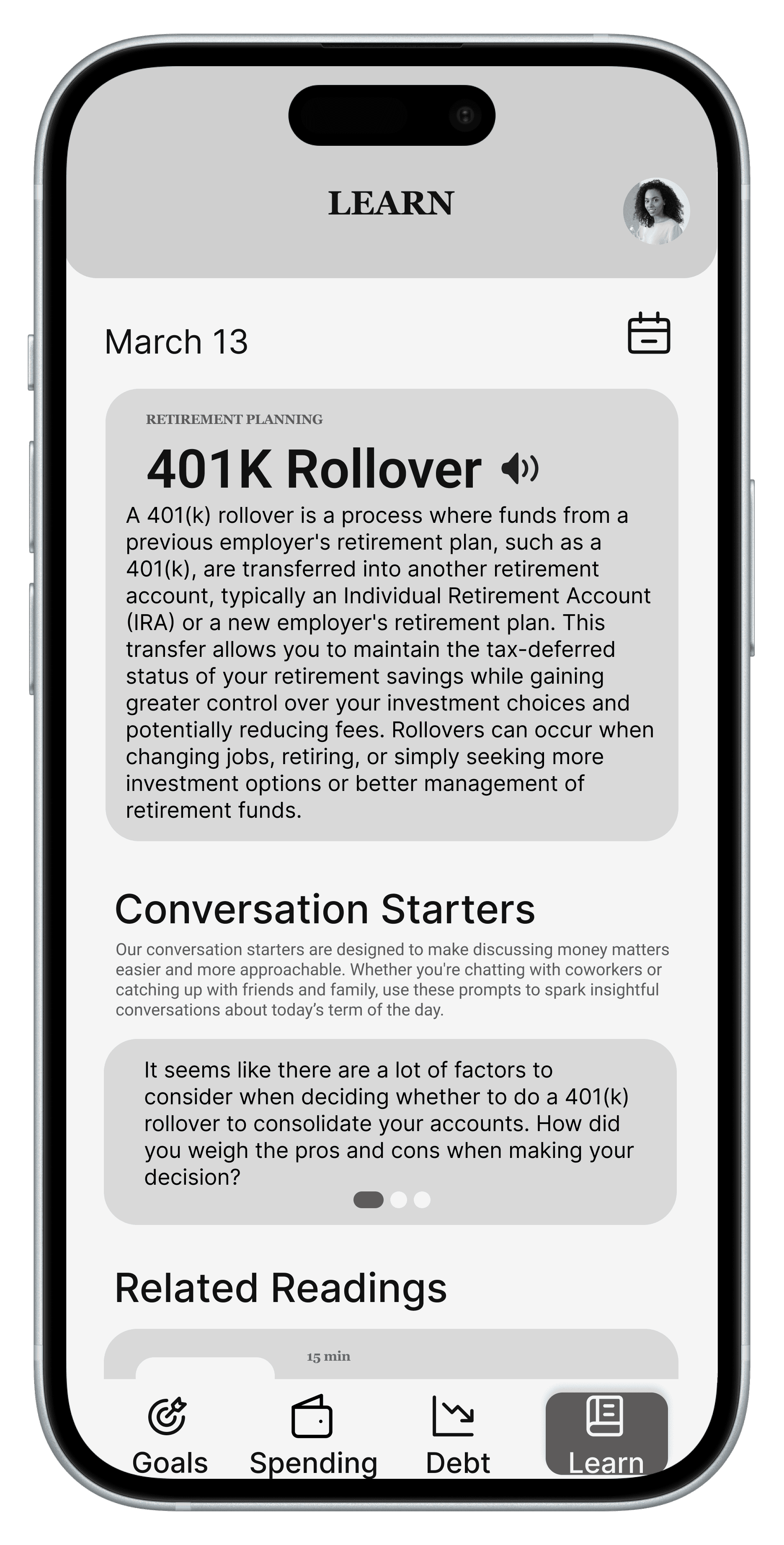
Since all sections now aligned around personal finance management, I placed them within the primary bottom navigation to create a clearer and more consistent structure.
Design System
Five different financial app color palettes were compared; all of them included some shade of green.
Emotions/feelings to convey
Composed/collected
Trust
Empowering
Pleasing/inviting
Color options
Green
Purple
Blue
Pastels
Final Choices
Color Palette

Font

High-Fidelity Prototype
First Iteration
Evaluation
High-Fidelity Feedback Sessions
User Testing
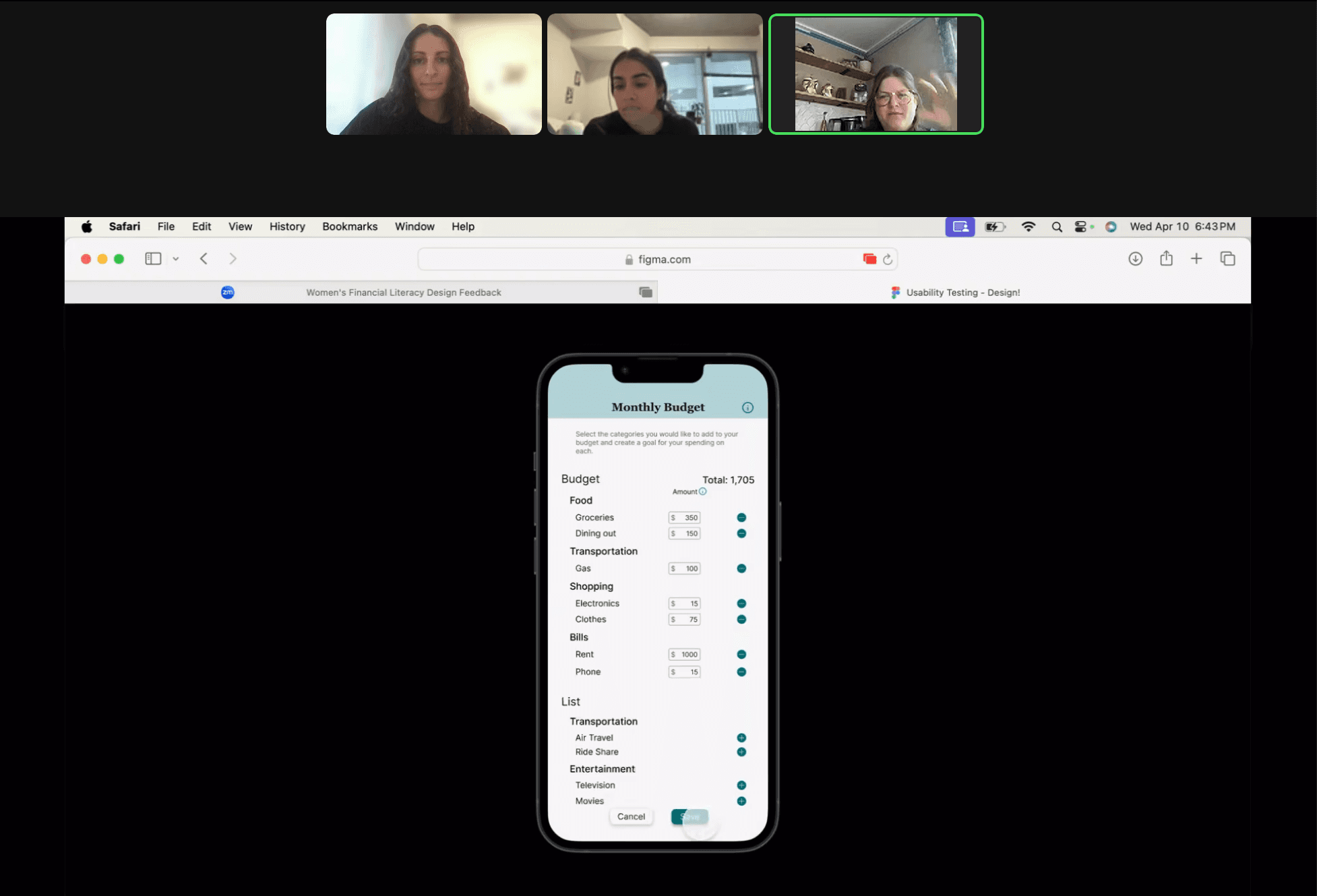
The high-fidelity prototype was tested with 8 target users for usability, comprehension, appeal, and balance.
Protocol:
60 min long on Zoom
5 flows divided into 1-3 tasks each
Follow-up questions for each task, including difficulty ratings
Wrap-up questions with free-explore time
Heuristic Evaluations
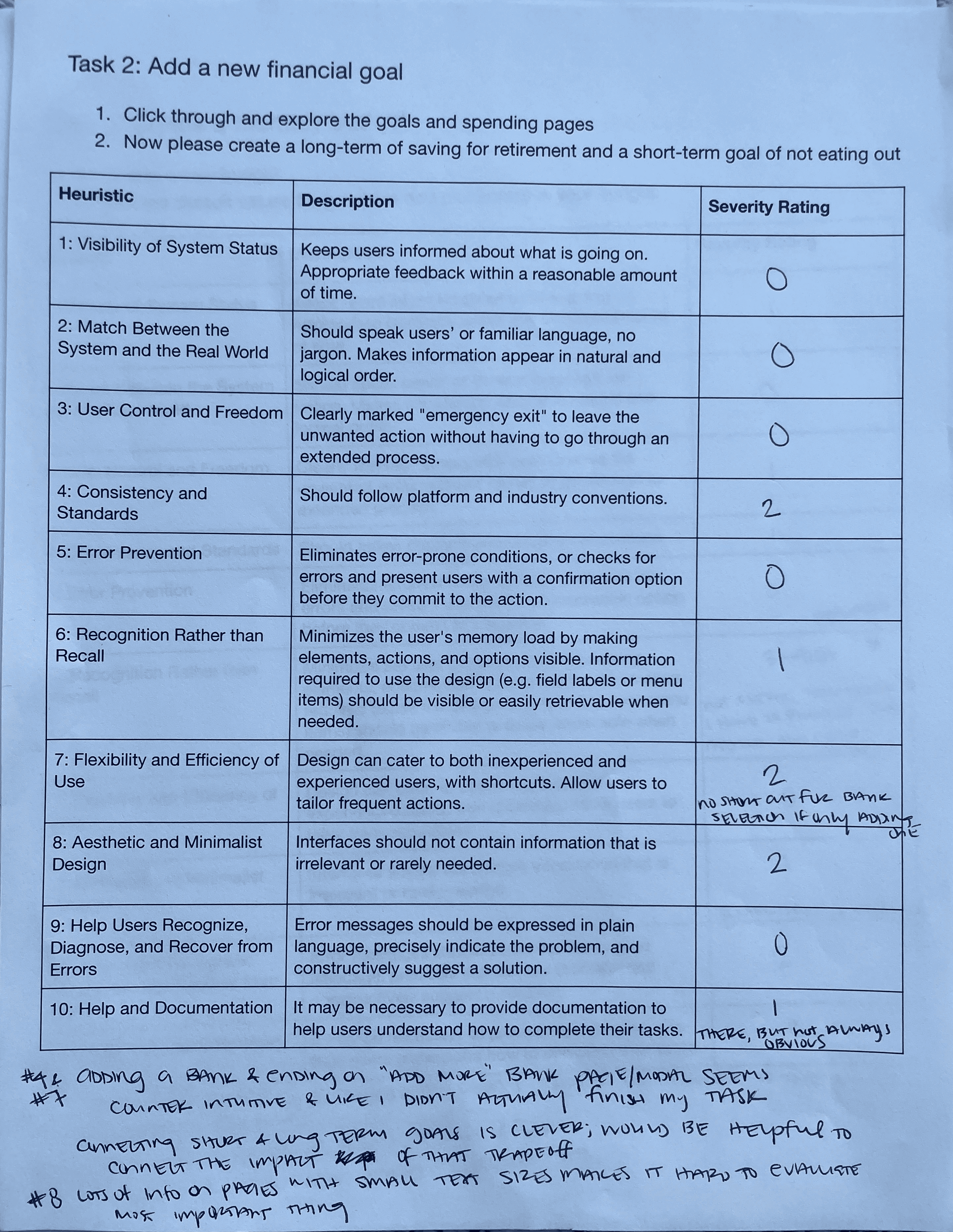
Our 4 evaluators were asked to rate based off of Nielson Norman’s 10 Usability Heuristics and conventions within the financial technology industry.
Evaluators:
Sejal; UX Researcher @ Visa
Gabby; UX Designer @ Intuit
Monet; UX Designer @ Square
Sally, UX Researcher @ LendingClub
Analysis
We analyzed our findings by compiling the feedback into averages.
User Testing Average Difficulty Self-Reported
Onboarding: 1.125 (very easy)
Goal Setting & Tracking: 1.36 (very easy)
Budgeting &Tracking: 1.31 (very easy)
Debt Payoff Planning: 1.81 (fairly easy)
Daily Learning: 1.25 (very easy)
Heuristic Evaluation Ratings
Visibility of System Status
Match Between System & Real World
User Control & Freedom
Consistency & Standards
Error Prevention
Recognition Rather than Recall
Flexibility & Efficiency of Use
Aesthetic & Minimalist Design
Help Users with Errors
Help & Documentation
Key Insights
Customizability
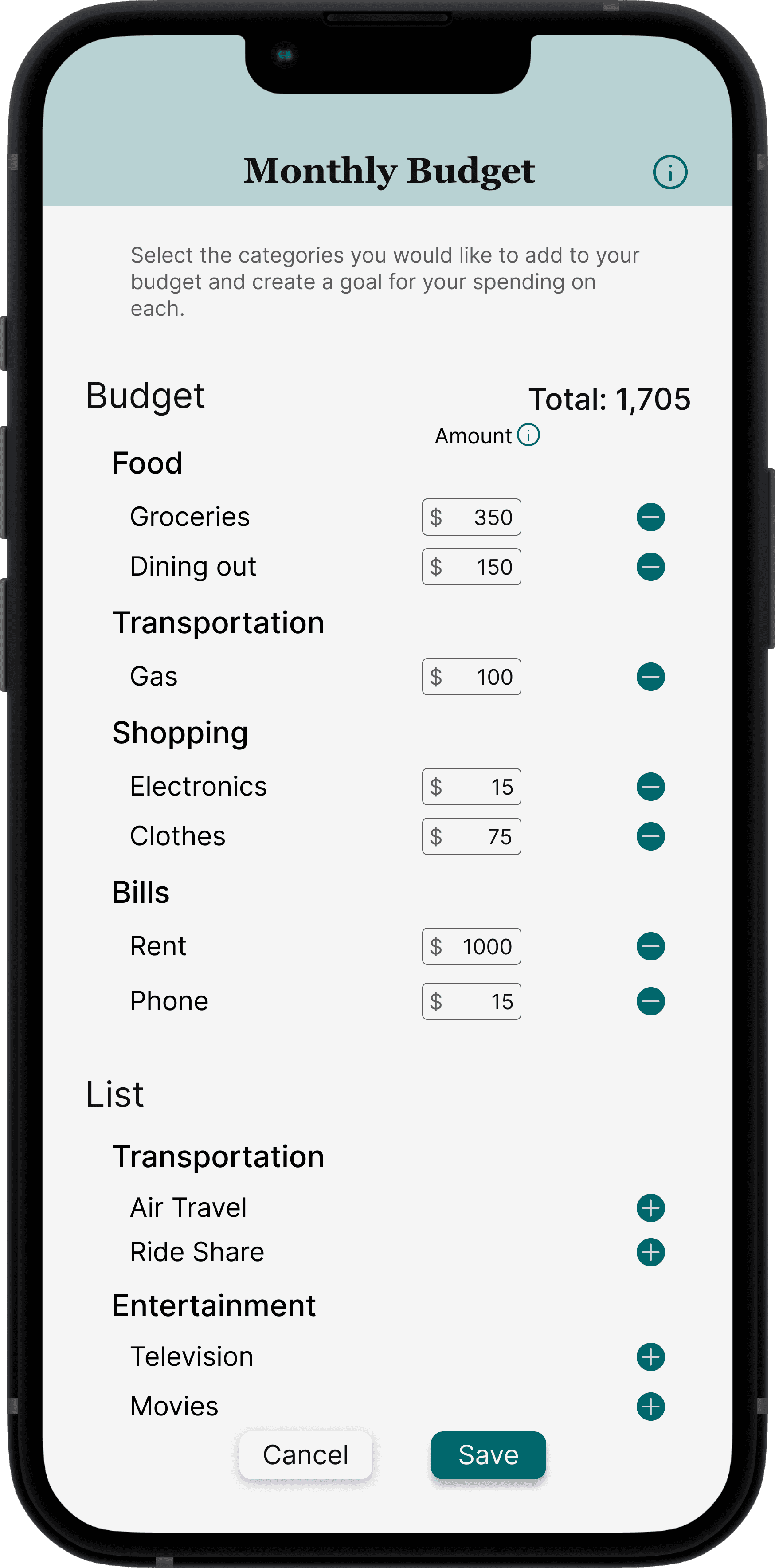
Participants wished for more options in budgeting and goal tracking
Preferences
Users favored different functions of the product
Consistency & Standards
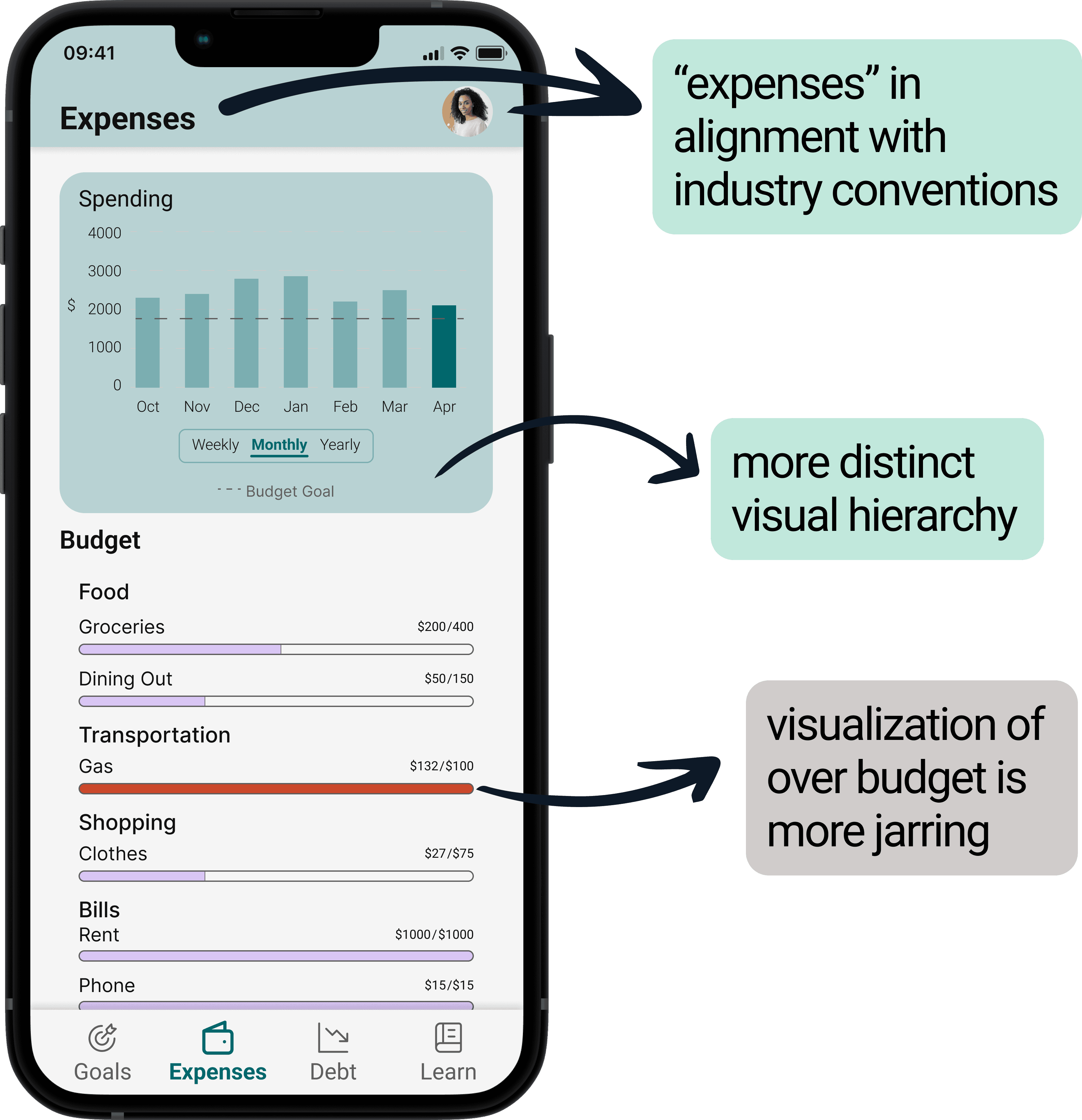
Users felt some designs did not meet industry standards
Visibility of System Status
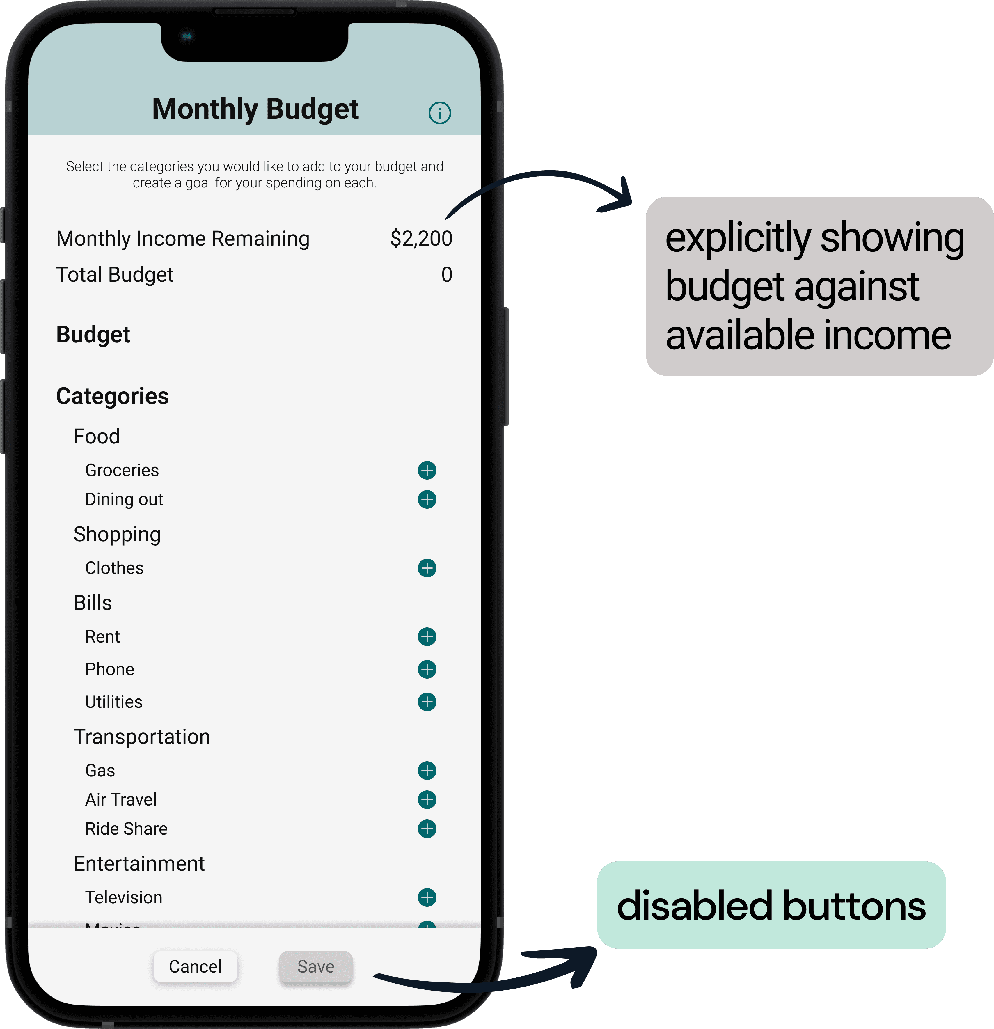
Some areas lacked adequate user information
Prototype Iterations
Changes made based on user feedback
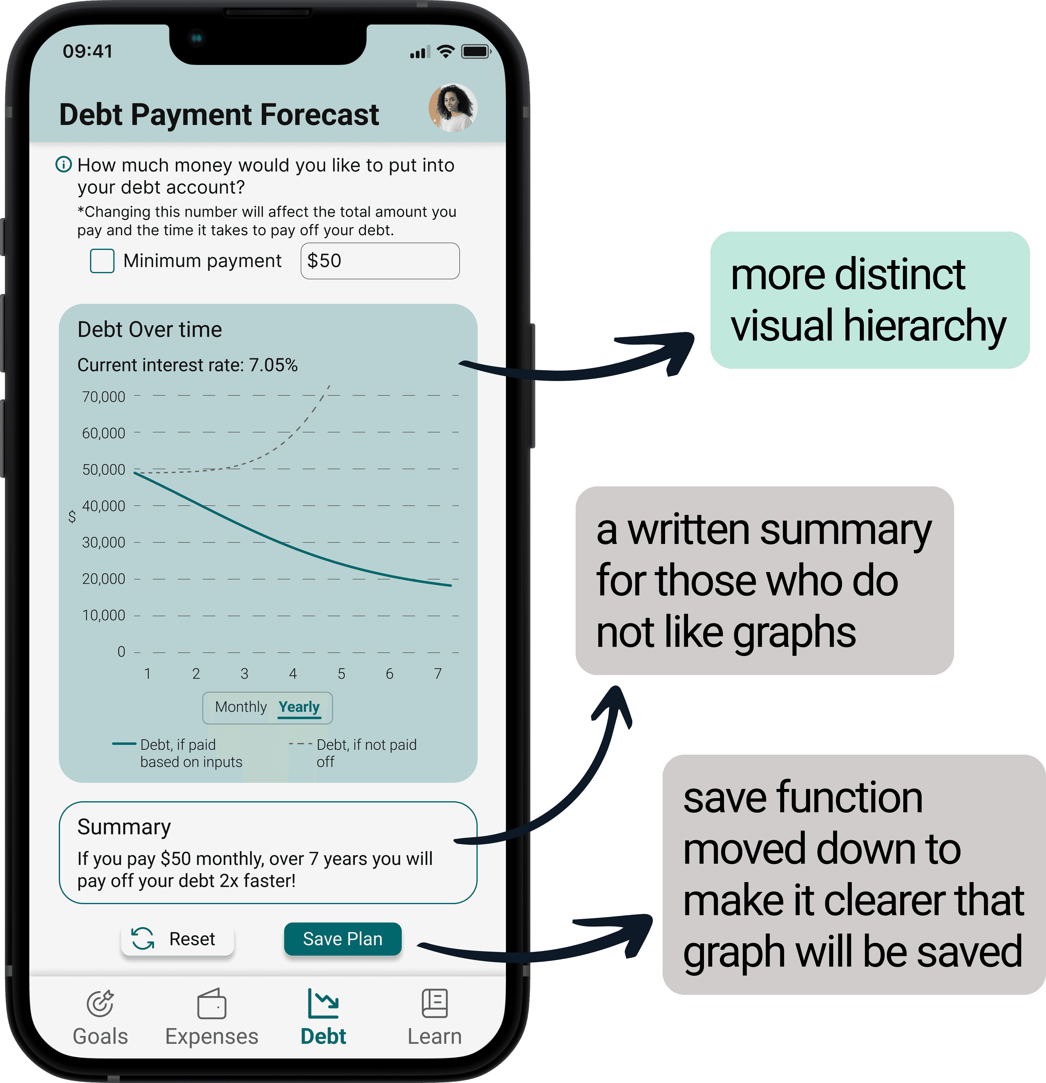
Changes made based on expert evaluators
Before
After
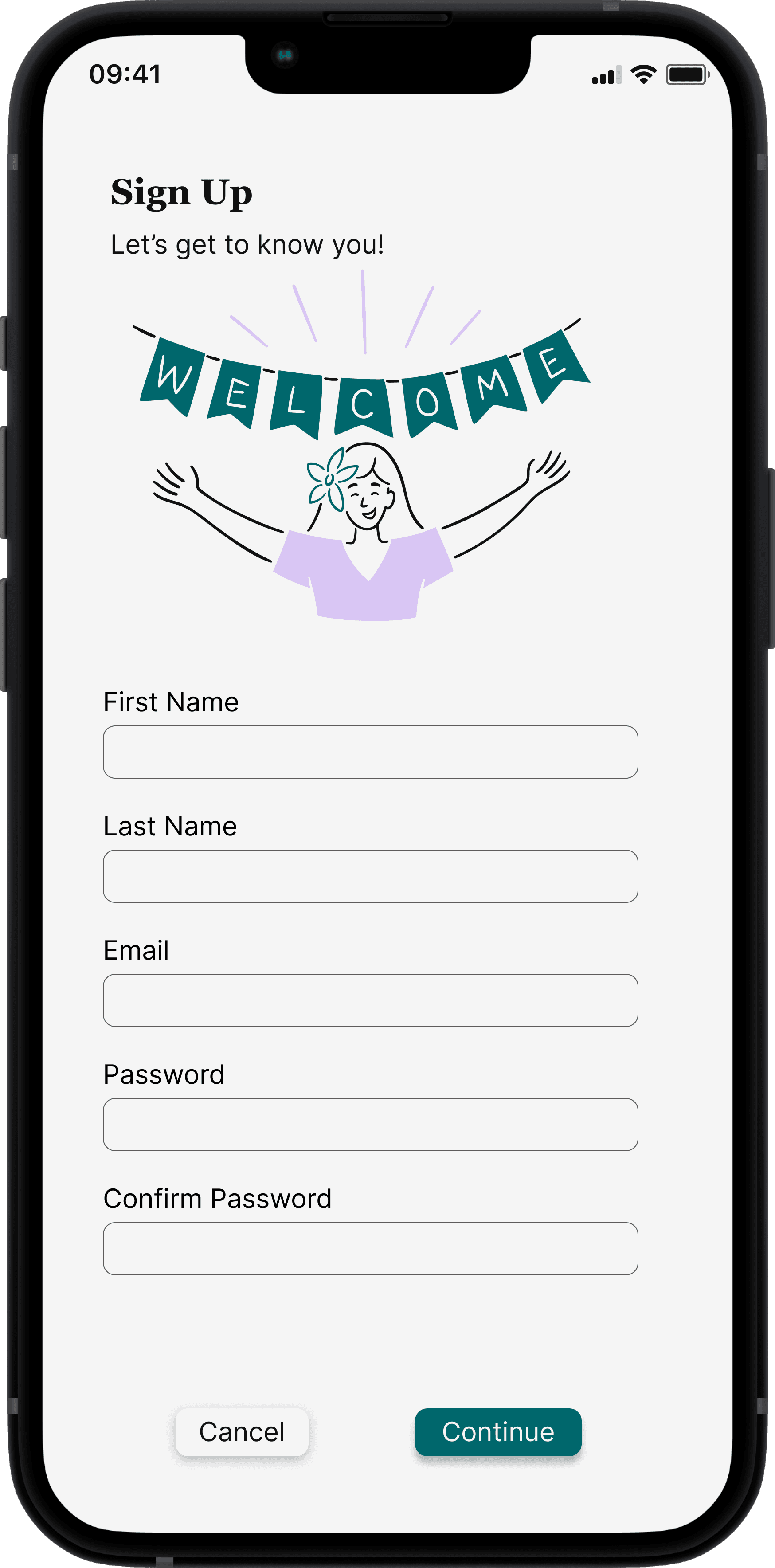
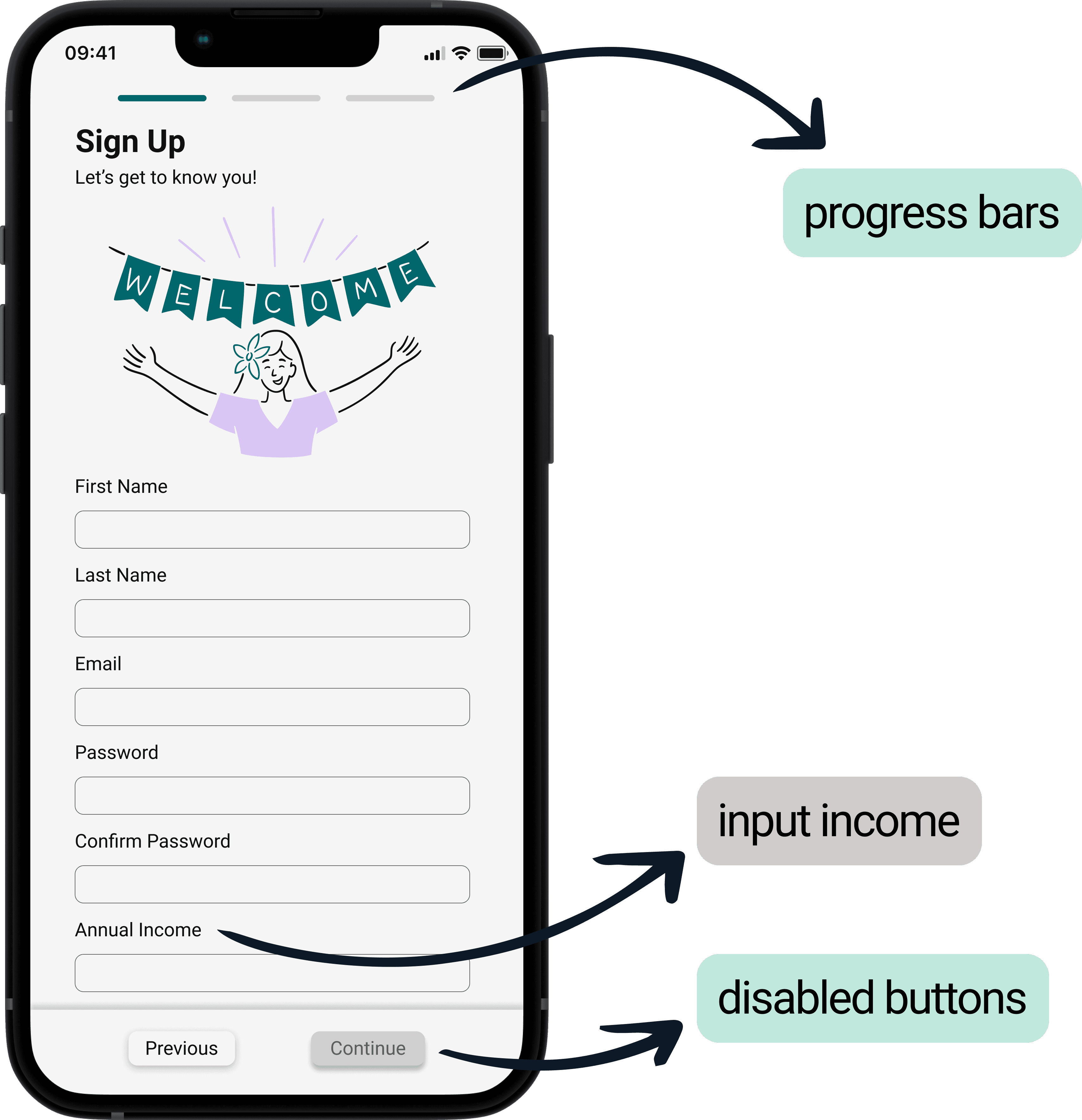
Onboarding
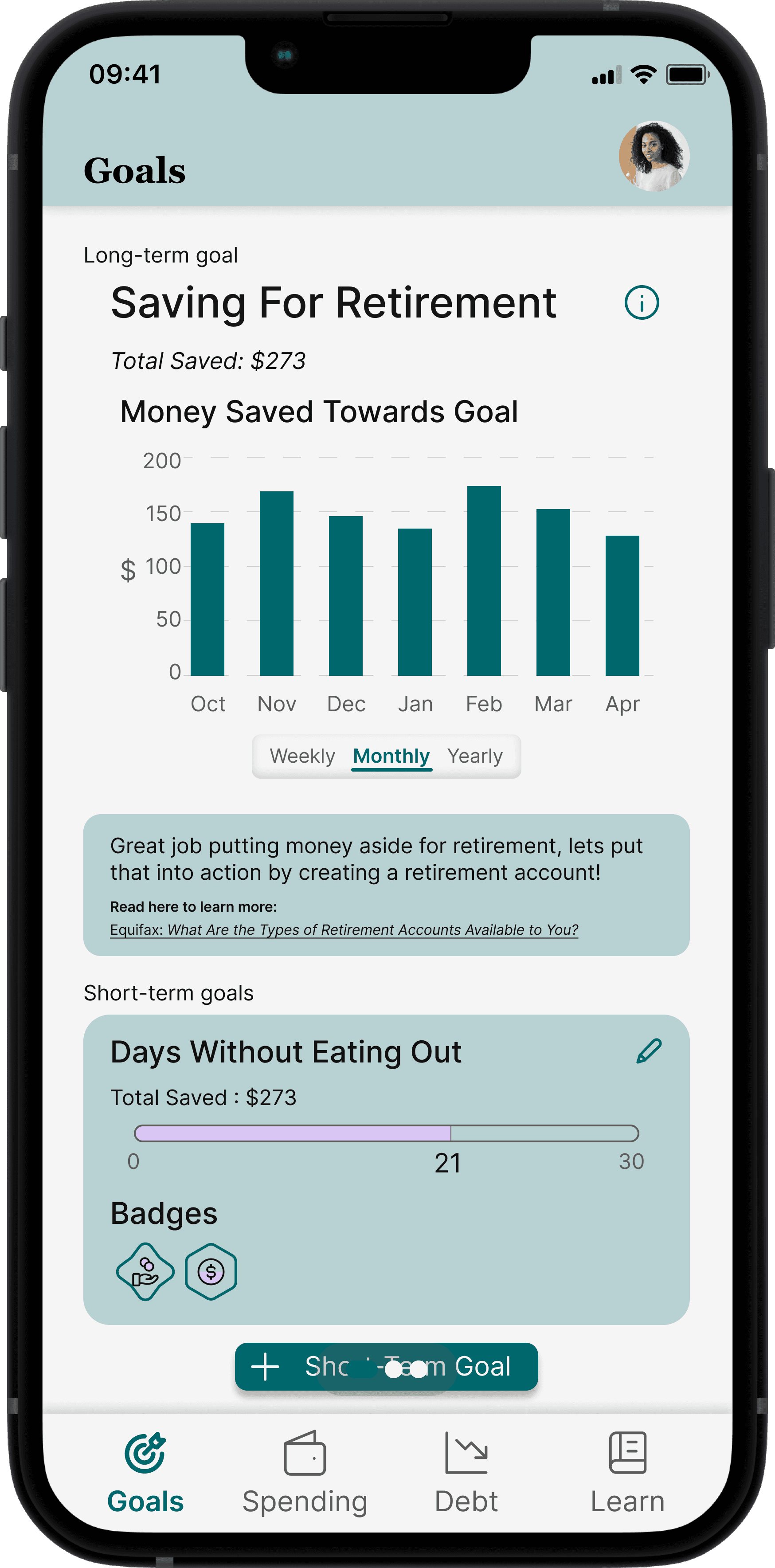
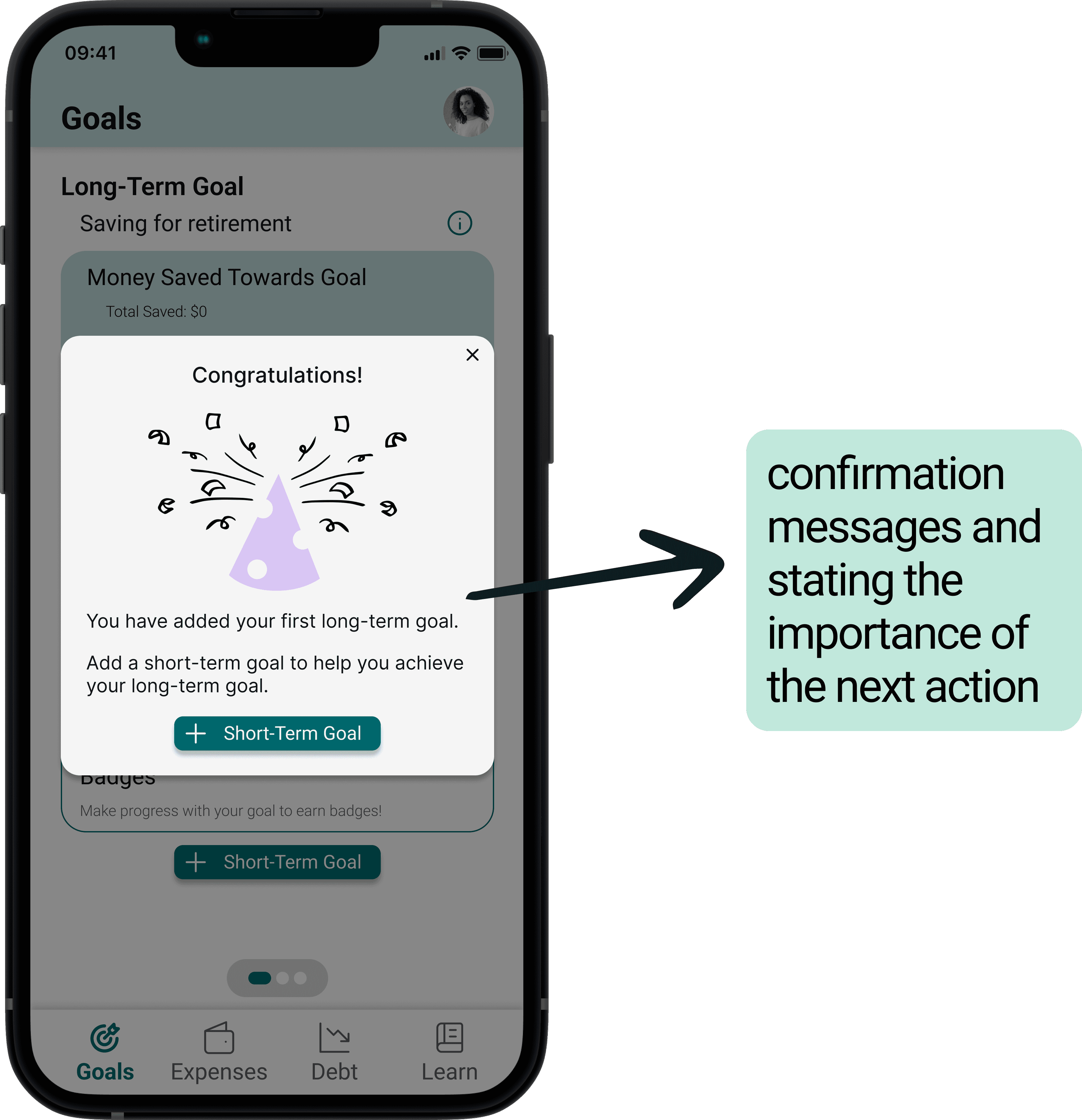
Goals
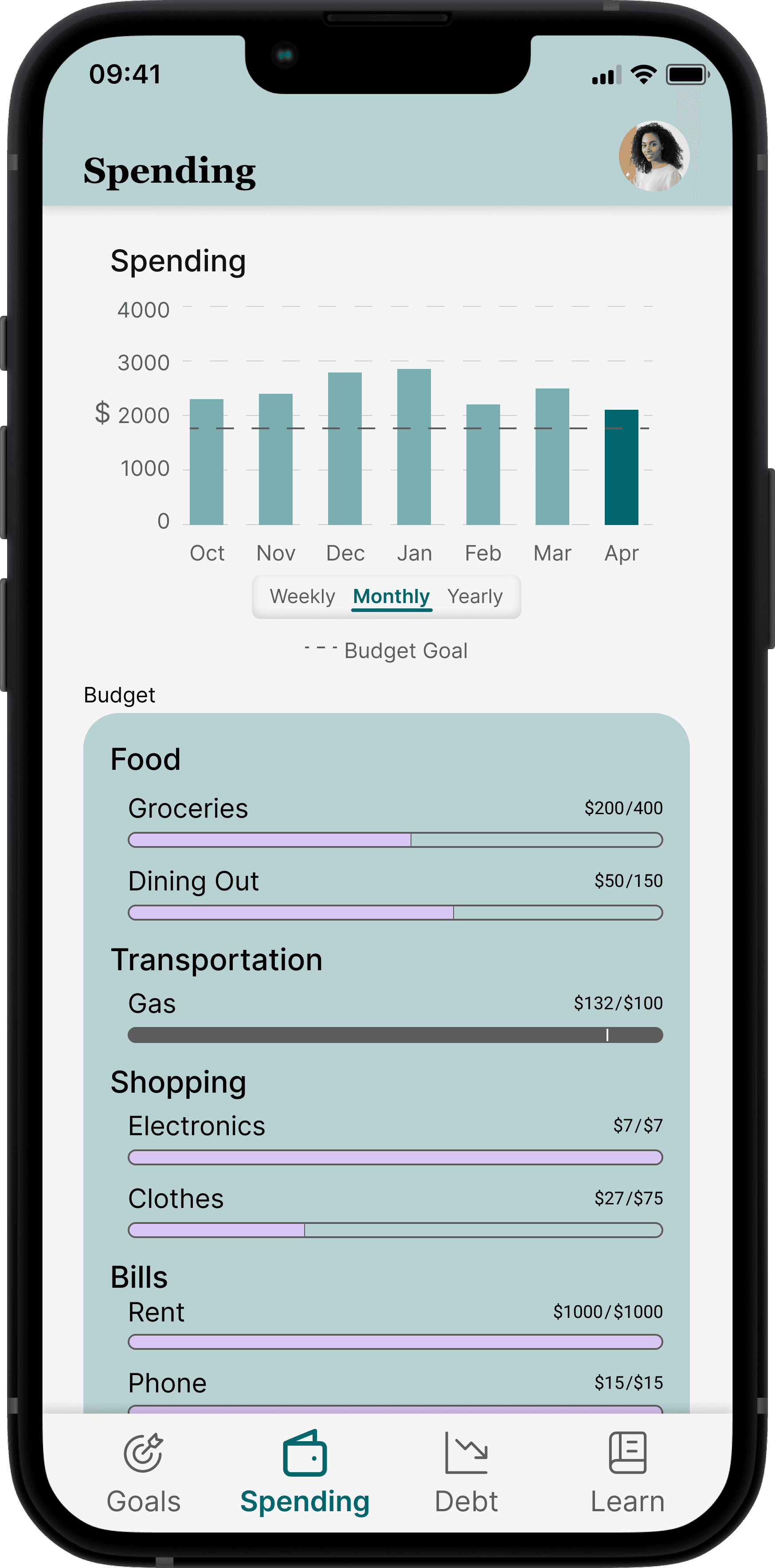
Expenses
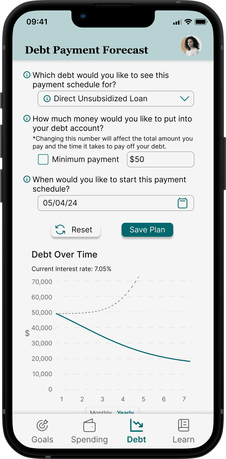
Debt
Next Steps
Homepage
Creating a homepage that will show highlights of positive change and habits with areas of improvement.
Balance
Creating balance within the application between having engaging, fun content and being a trustworthy source.
Longitudinal Study
Conducting a longitudinal study to examine retention factors and improvement in knowledge, confidence, and action long term.
Reflection
Prioritize Sampling a Diverse Set of Users Early
Engaging a diverse user group from the start can provide broad insights and helped create a more inclusive product. Initially, we used convenience sampling, but expanding our participant pool led to critical feedback and a pivotal design change.
Incorporate Expert Feedback Early On
Getting expert input earlier on would have improved our design's quality and helped avoid common pitfalls sooner.
Trust the Process
Following a structured UX process and listening to advice from our advisors, with patience for each stage, led to a more refined and user-centered product.